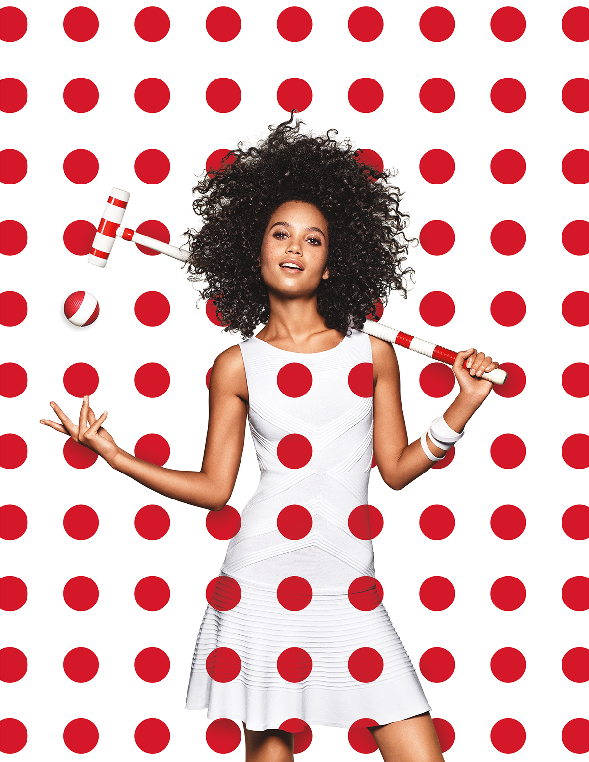
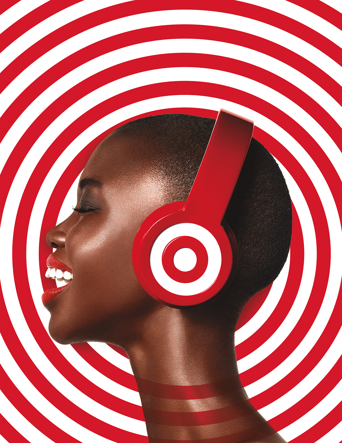
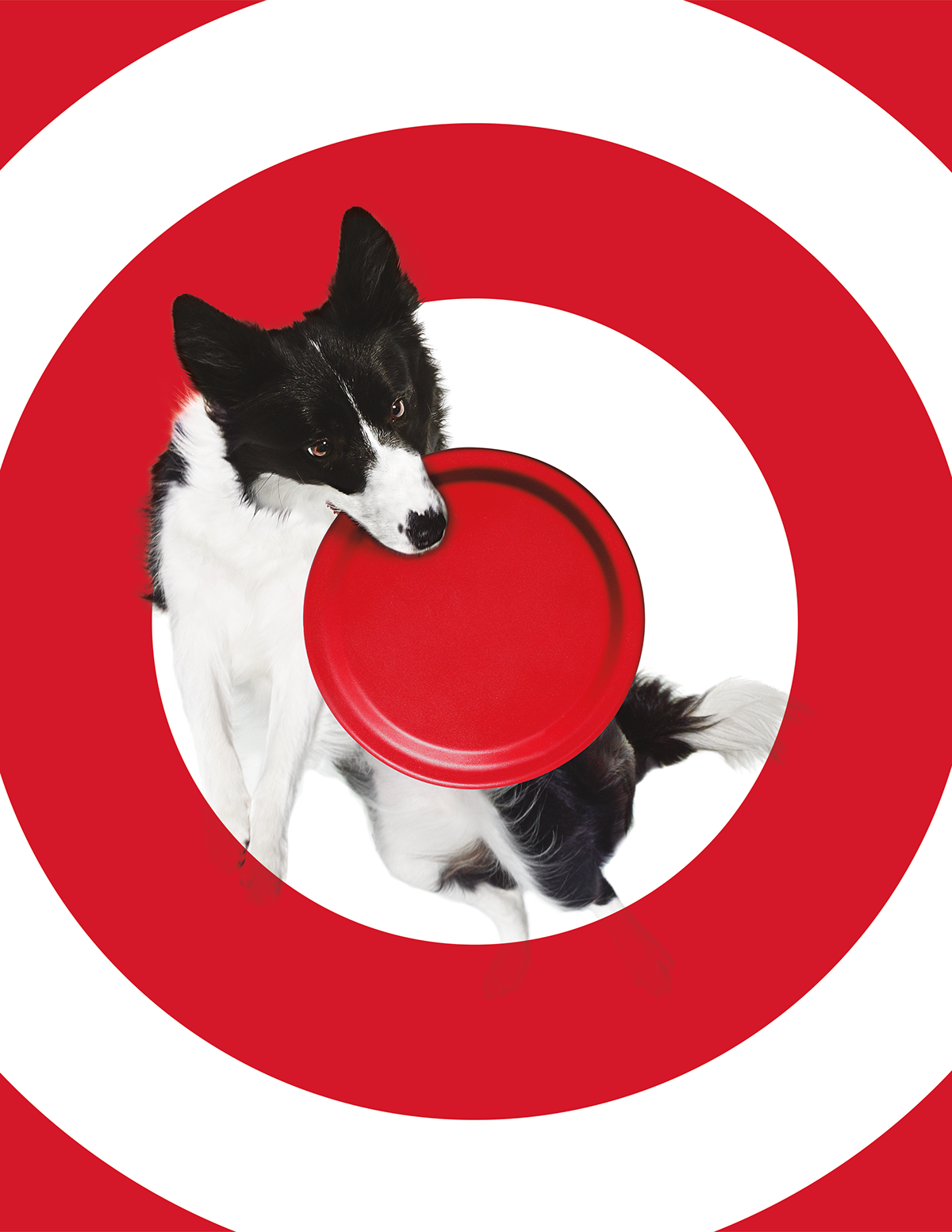
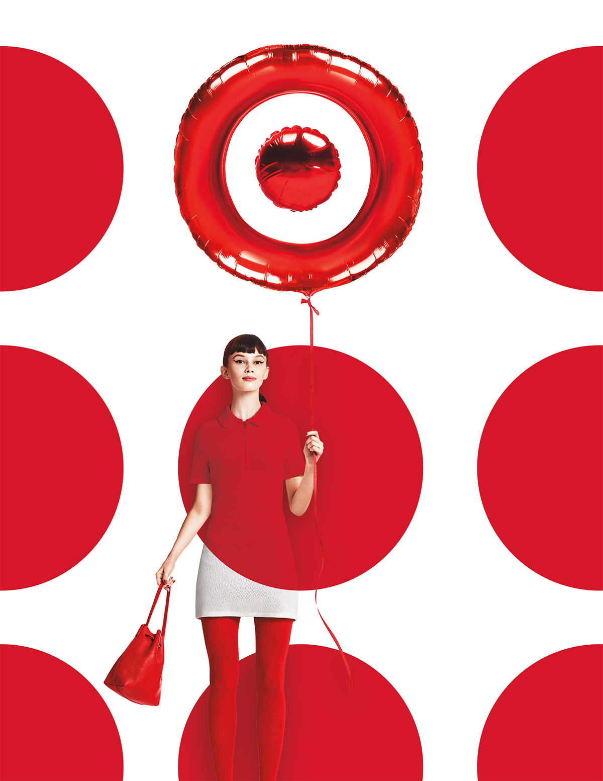
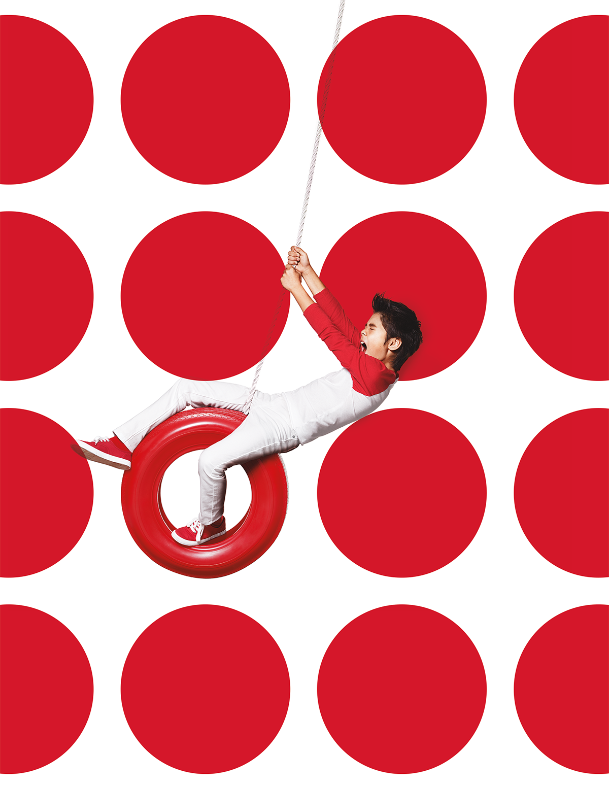
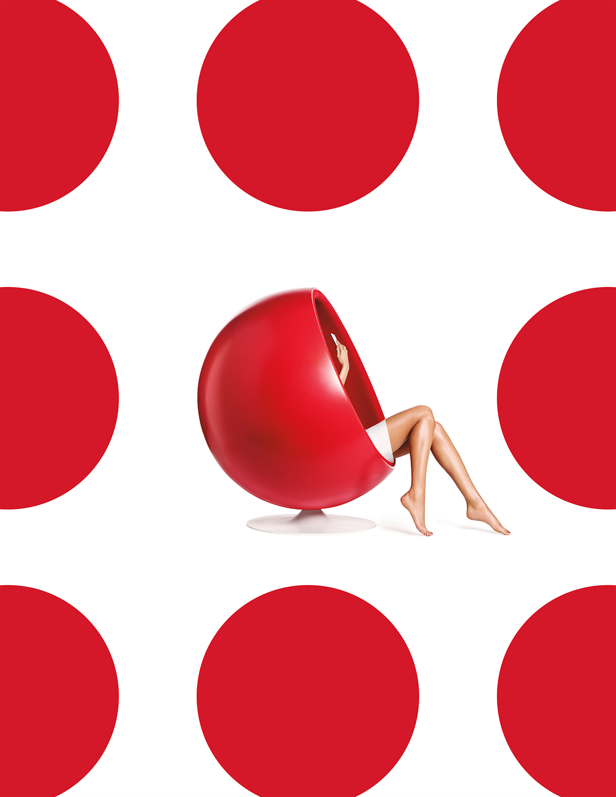
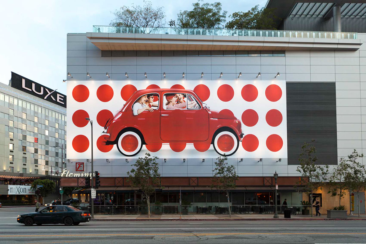
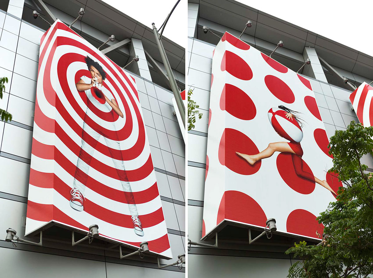
TARGET: DOTS & RINGS BRANDING
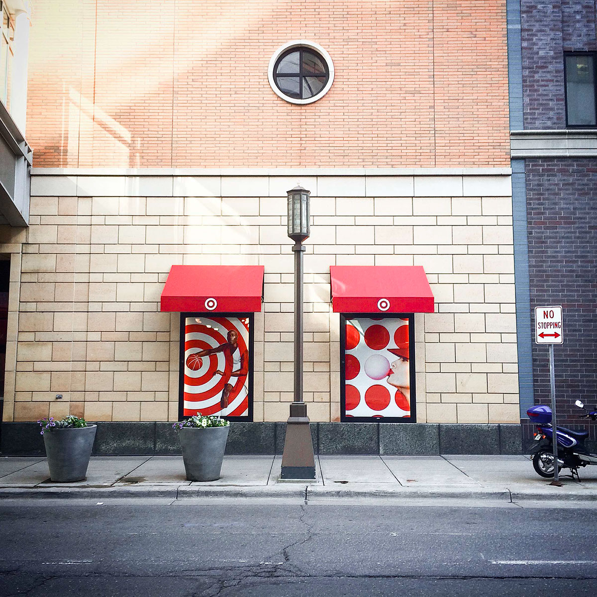
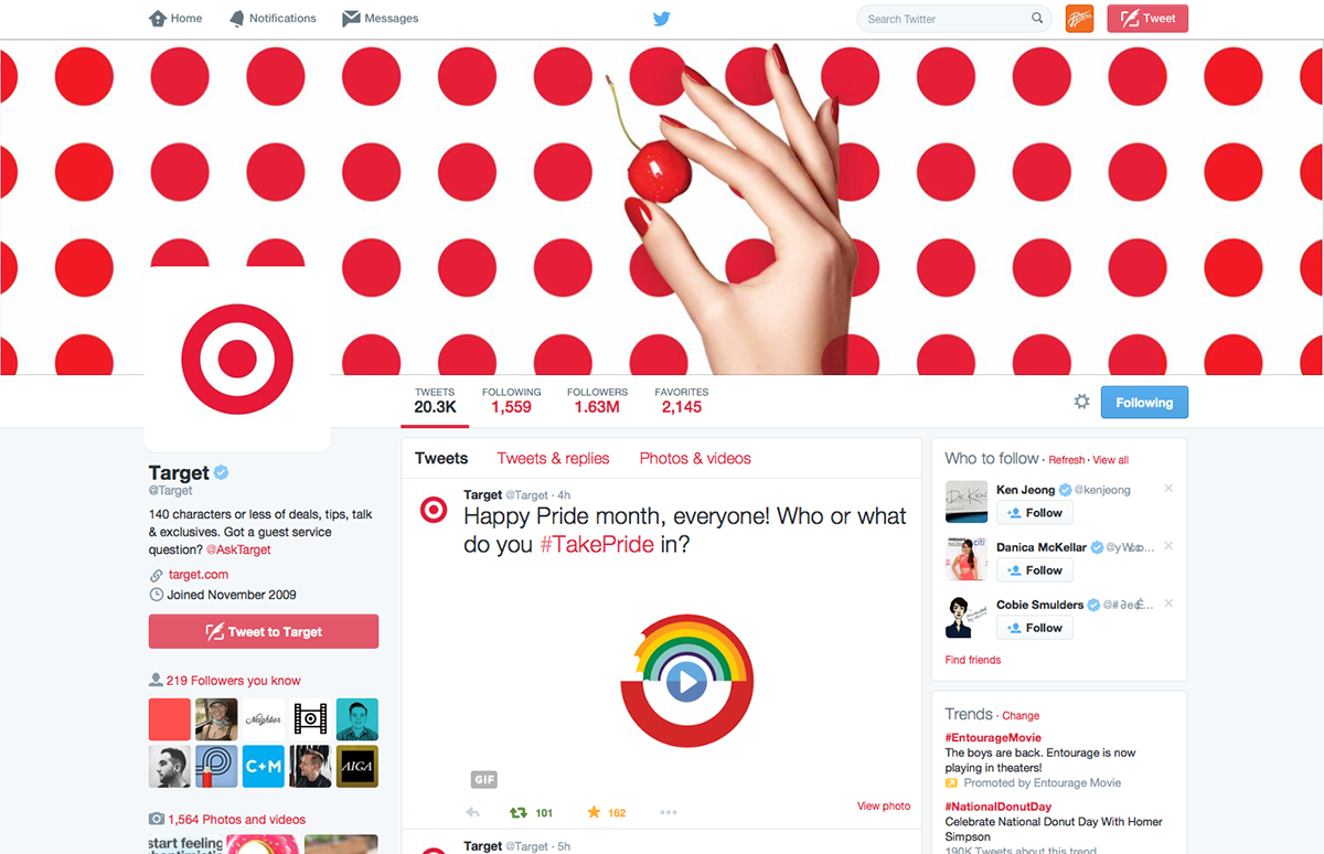
Target's logo is elegantly simple. One dot. One ring. This brand campaign actively deconstructs this iconic graphic identity. Instead of a static symbol, it becomes a rhythmic pattern, and a playful player in the choreography of life.
The result is a collection of images that embody the lively aspirations of the Target brand. It’s living and breathing the logo in a bold new way.
Recognition:
Clio • Communication Arts • How Magazine
The result is a collection of images that embody the lively aspirations of the Target brand. It’s living and breathing the logo in a bold new way.
Recognition:
Clio • Communication Arts • How Magazine
This project was created while I worked at Target. Here’s a list of the team involved:
CCO: Todd Waterbury
ECD: Jason Langer
GCD: David Richardson
Design/ACD: Allan Peters
Style AD: Rachel Arford
ECD: Jason Langer
GCD: David Richardson
Design/ACD: Allan Peters
Style AD: Rachel Arford


On the last day they photographed me for fun.

Process Shots: